Project Description
Problem Statement
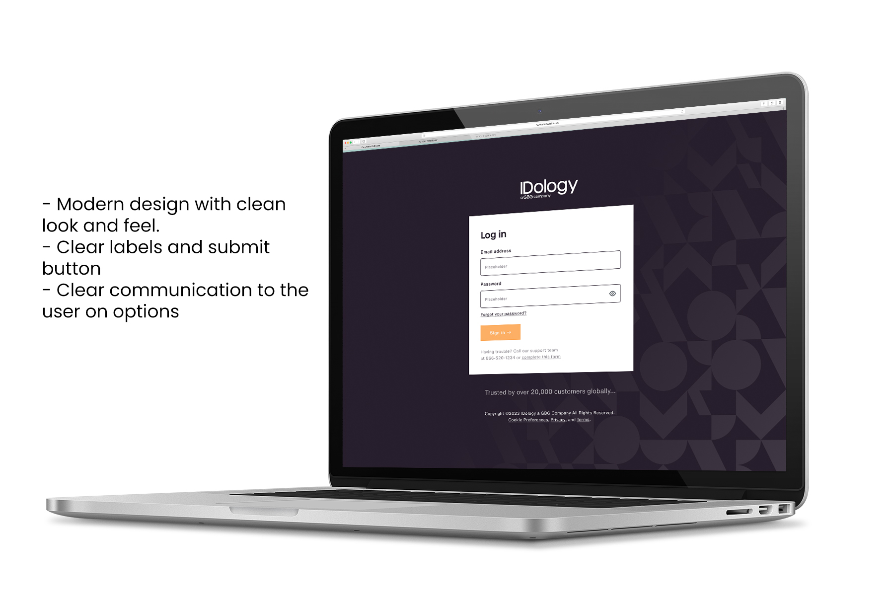
The current platform, aged over 10 years, is outdated, unfriendly, and challenging to navigate. Before embarking on a comprehensive platform redesign, the team aimed to showcase the potential of a redesign, starting with the login page. The goal was to provide a glimpse of what a modern, effective design could look like.Objectives & Goals
- Update the Login Page: Transform the existing login page into a modern and user-friendly interface.
- Reestablish Trust: Instill confidence in customers and users by presenting a fresh and modern design, signaling a commitment to improvement.
- Foundation for Larger Redesign: Use the redesigned login page as a foundational element for the broader platform redesign initiative.
- User-Friendly Experience: Enhance the login process, making it more straightforward and user-friendly.
- Reduce Customer Support Calls: Introduce a support form within the login page to limit unnecessary calls, while still providing a contact number for users who prefer a call.
Internal Product Users
- Product Managers
- Sales Team
- Customer Support Representatives
Features & Functionalities
- Cleaner Login Page: Streamline the visual elements of the login page to present a more polished and modern appearance.
- Support Form Integration: Replace the traditional email contact with a support form within the login page, offering users an alternative to calling customer support.
- Multiple Designs: Initially, four designs were conceptualized, but through iterative processes and feedback, three designs were chosen for implementation.
- A/B Testing: Opted for A/B testing to objectively determine which design instilled a greater sense of trust and security.
Product User Challenges
- The login process did not present significant challenges for users.
User Personas
- No specific user personas were developed for this project.
A/B Testing Integration
Description and Test Questions:
- Crafted clear and concise descriptions for each design variant, emphasizing changes made.
- Formulated targeted test questions to gauge user preferences, ease of use, and overall satisfaction.
Navigation Workflow:
- Designed a seamless navigation workflow to guide participants through the A/B testing process comprehensively.
Condition Statements:
- Established condition statements to ensure consistency and control over the testing environment.
Maze Report Findings:
- The Maze platform was utilized to conduct A/B tests and gather valuable insights from users.
User Feedback and Preferences
- Overall User Sentiment:
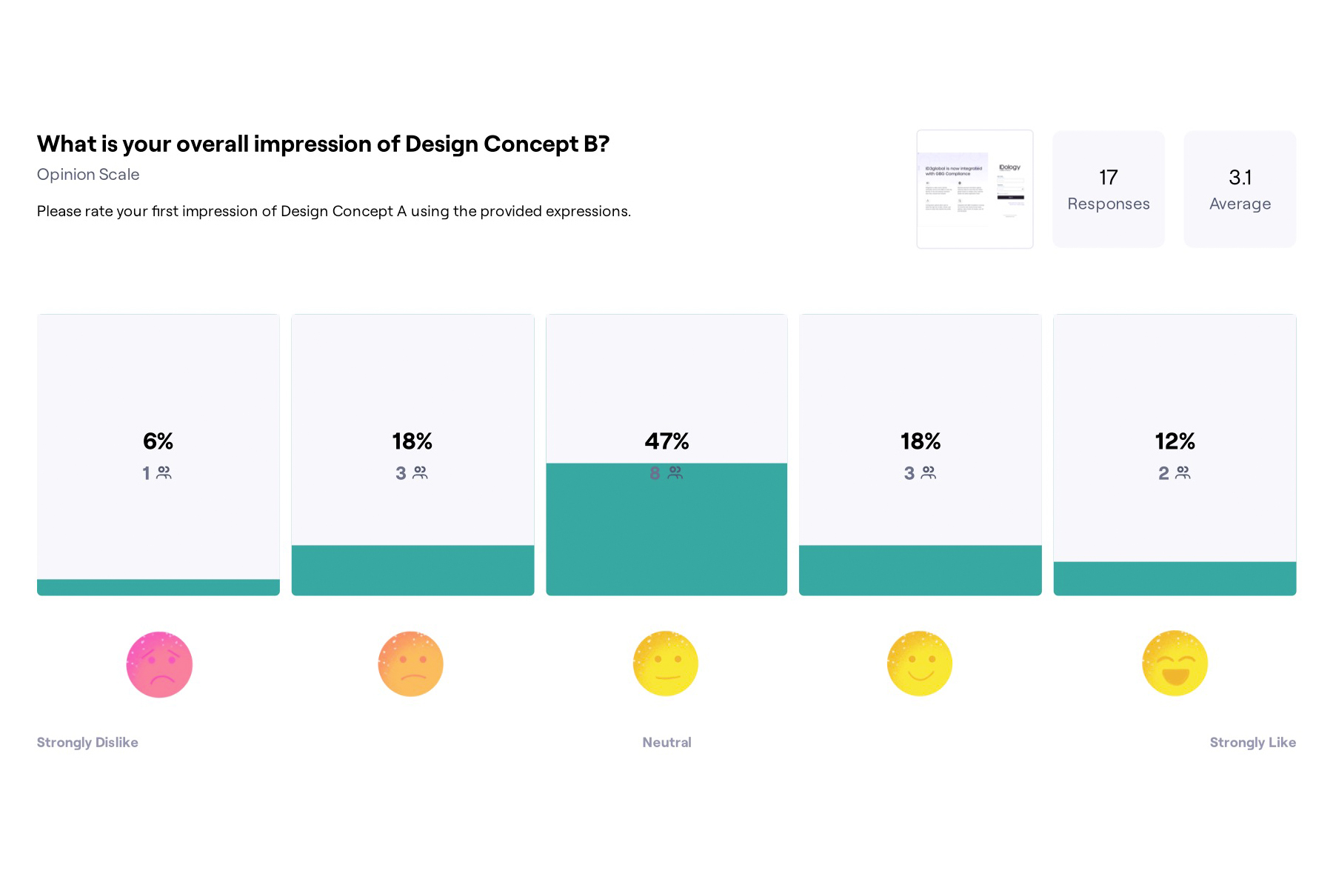
- Most users expressed a positive sentiment, stating that the designs instill trust, and they appreciated the new design.
- Design Preferences:
- Design A received 53% preference, Design B received 35%, and Design C received 12%.
- Specific user feedback highlighted the preference for simplicity, clarity, and a standard login page appearance.
- User Quotes:
- "Clear purpose, looks like a standard login page on other services, so I know what's expected. Assuming "Placeholder" in fields is a mistake? I'd usually show opening hours for a phone line, unless it's 24/7." - Tester #177584172
- "I do not like the companies in the bottom section." - Tester #177330676
- "Is simple, just there, ready to start working and not distracting with additional information." - Tester #177451938
- "I like the simplicity of it. No adverts or extra information which I don't need. A simple and straightforward Login page. It feels like I'm logging into a product. I'm not sure if the logos at the bottom really add any benefit to me, as my company or I have already technically purchased this product. Unless they are going through a free trial. They feel more beneficial in a marketing landing page or a registration page to add trust. The 'having trouble' information may be difficult for visually impaired users to see as the colour contrast feels very light. Worth checking if this passes Colour contrast for accessibility." - Tester #146644500
Synthesizing Results
-
- Utilized quantitative data from the Maze report to determine user preferences.
- Integrated qualitative insights from user quotes to understand specific aspects that resonated or needed improvement.
A/B Testing Timeline
- A 3.5-week timeframe, involving detailed preparation, execution of tests, and analysis of results.
Results and Key Takeaways
- The combination of internal feedback and A/B testing provided valuable insights.
- The selected design not only met user expectations but showcased improvements in security and user experience metrics.
Conclusion
- The case study demonstrates effective problem-solving, adaptability to constraints, and successful project leadership.
- It emphasizes the importance of a user-centered approach, showcasing positive impacts on user acquisition and retention.


